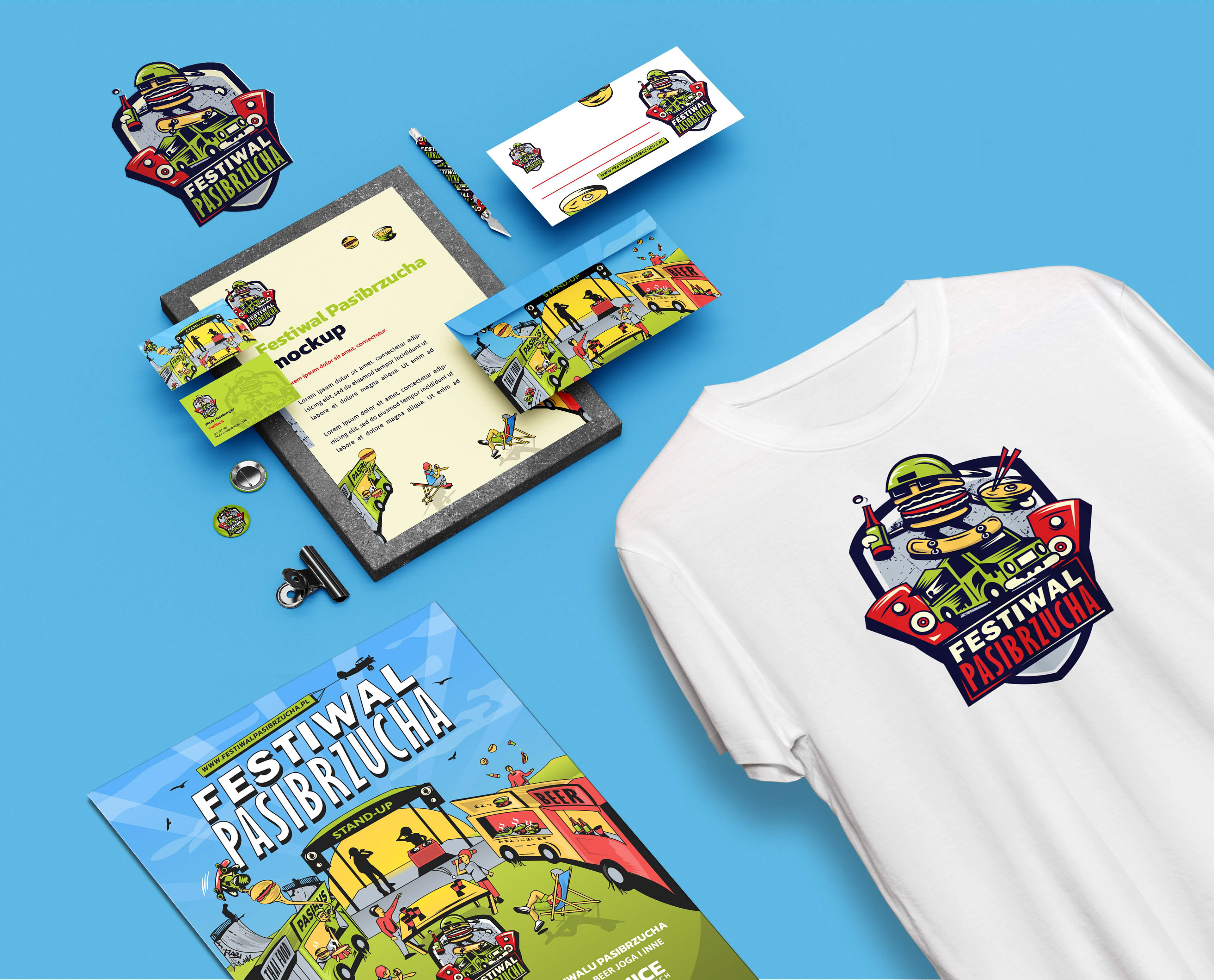
Designed the end-to-end branding for Pasibus at the Polish Street Festival. The goal was an inclusive, energetic aesthetic, anchored by a custom logo reflecting the brand’s street culture. This comprehensive project demonstrated the power of integrated visual communication, resulting in a high-visibility campaign across Wrocław.
Strategic Challenge
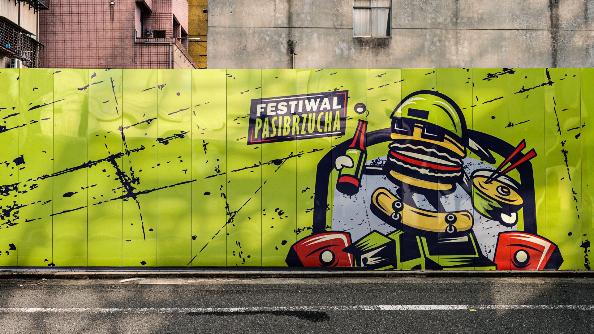
A mass event is an environment of visual chaos. Thousands of people, hundreds of exhibitor logos, intense sound and smell stimuli. The challenge was not to ‘look nice’, but to be noticeable. The system had to perform a navigational and organising function without losing its relaxed, entertaining character.
Visual System Architecture
The concept of the ‘Controlled Chaos Strategy’.
Atomic Design: I created a library of ‘stickers’ and illustrations (food icons, musical instruments) that can be freely mixed and matched to create new compositions without losing consistency.
Colour Palette: High contrast. Neon colours combined with thick black outlines. This ensures legibility even in difficult lighting conditions (evening concerts) and on small social media screens,
Typography: A thick, poster-style font that ‘shouts’ as loudly as the festival sound system.
Execution at Touchpoints
Social Media: Dynamic post templates that allow for quick communication (e.g., changes in the lineup) while maintaining 100% brand recognition in the feed.
On-Site Branding: Site maps, wristbands, zone markings. Colour consistency allowed participants to intuitively distinguish between the food zone and the music zone.
Conclusion: In this project, consistency is not about minimalism, but about the rigorous application of a defined style of illustration and typography. This makes the brand flexible (it can respond to trends) but always remains true to itself.


Thank you!
Stay tuned, follow me on Instagram: @kamilowany