

Introduction
Forma Na Szczyt, a leading provider of services to the outdoor, sports, and mountain industries, offers unparalleled support to climbers of Mount Everest and Mont Blanc, as well as for marathon and ultramarathon preparations. Recently, Karol, the company’s leader, requested a logo refresh to enhance its professional appeal and versatility.
Despite the brand’s outdoor focus, its communication is primarily digital, with corporate outfits worn during trips like the Monte Rosa camp. The new, simplified grid-based logo is adaptable for both the typographic part and the symbol itself. As the weekend approaches, I encourage you to spend time in nature, perhaps with Forma Na Szczyt.

Strategic Challenge
The high-altitude expedition industry is based on absolute trust. There is no room for error here. Customers entrust their lives to the company. The branding could not resemble a typical gym or fitness app. It had to communicate professionalism, technical precision, endurance, and safety.

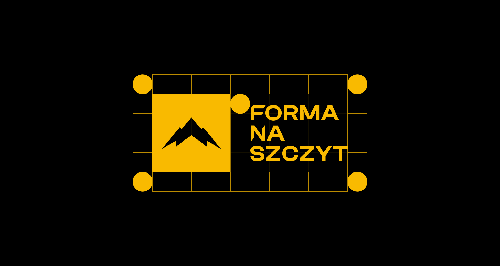
Visual System Architecture
Symbolism: The logo is designed to resemble a quality certificate or marking on military/mountaineering equipment.
Usability: Elimination of unnecessary embellishments. The form must be legible when embroidered on thick fleece, printed on technical equipment or displayed on a sports watch.


Consistency Verification
The most important test for this system was not an advertising campaign, but reality.
Mount Everest Case: The brand logo, placed on the cover of a training book, was physically carried to the summit of Mount Everest by a customer.
Conclusion: This proves that branding has become more than just a service company logo for the user. It has become a symbol of his own success (‘Badge of Honour’). The visual consistency of the brand with its mission (conquering peaks) has been achieved 100%.


Thank you!
Stay tuned, follow me on Instagram: @kamilowany
