
The In Asia logo evokes a sense of mystery, stimulating not only our taste buds but also our curiosity.It transports us to an unfamiliar space, a jungle, where we come face to face with a tiger - one of Asia's symbolic animals. Traditionally, the tiger is associated with the element of wind. In a restaurant setting, it is easy to imagine that the tiger is the one spreading the delicious aromas straight from the kitchen.
The restaurant's logotype features a juxtaposition of two colors: strong pink and subdued green, which complement each other well. This combination allows the restaurant to stand out in the gastronomic market, which often lacks the courage to make bold design choices. To further enhance the logo, a design featuring a tiger skin can be added.
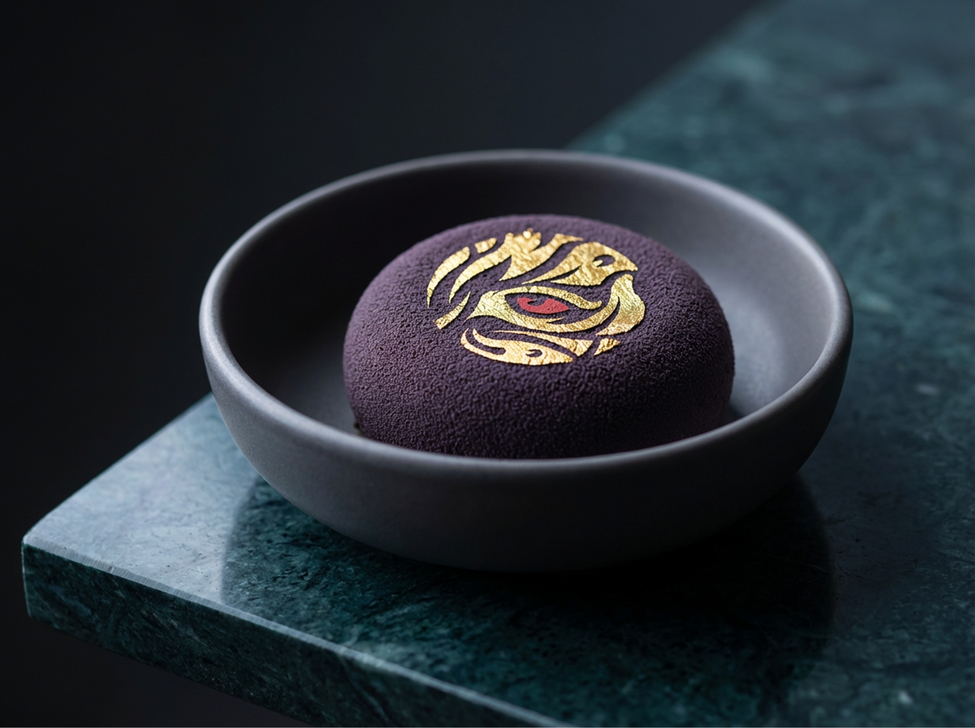
By highlighting the tiger's eye, the logo can capture the audience's attention and emphasize the restaurant's character.

Introduction
The In Asia logo is designed to evoke mystery and stimulate both taste buds and curiosity. It transports the viewer to a jungle where they encounter a tiger, a symbol of Asia and the element of wind, spreading delicious aromas from the kitchen. The logotype combines strong pink and subdued green, making the restaurant stand out in a market often shy of bold design choices.
Enhancing the logo with a tiger skin design and highlighting the tiger’s eye captures attention and emphasises the restaurant’s unique character.

Strategic Challenge
How to combine the cuisines of Thailand, Vietnam, Japan and China under one banner while avoiding kitsch?
The problem with many Asian restaurants in Poland is that they fall into stereotypes (dragons, red, bamboo). The aim was to create a cosmopolitan, modern brand that would fit in with the business district.

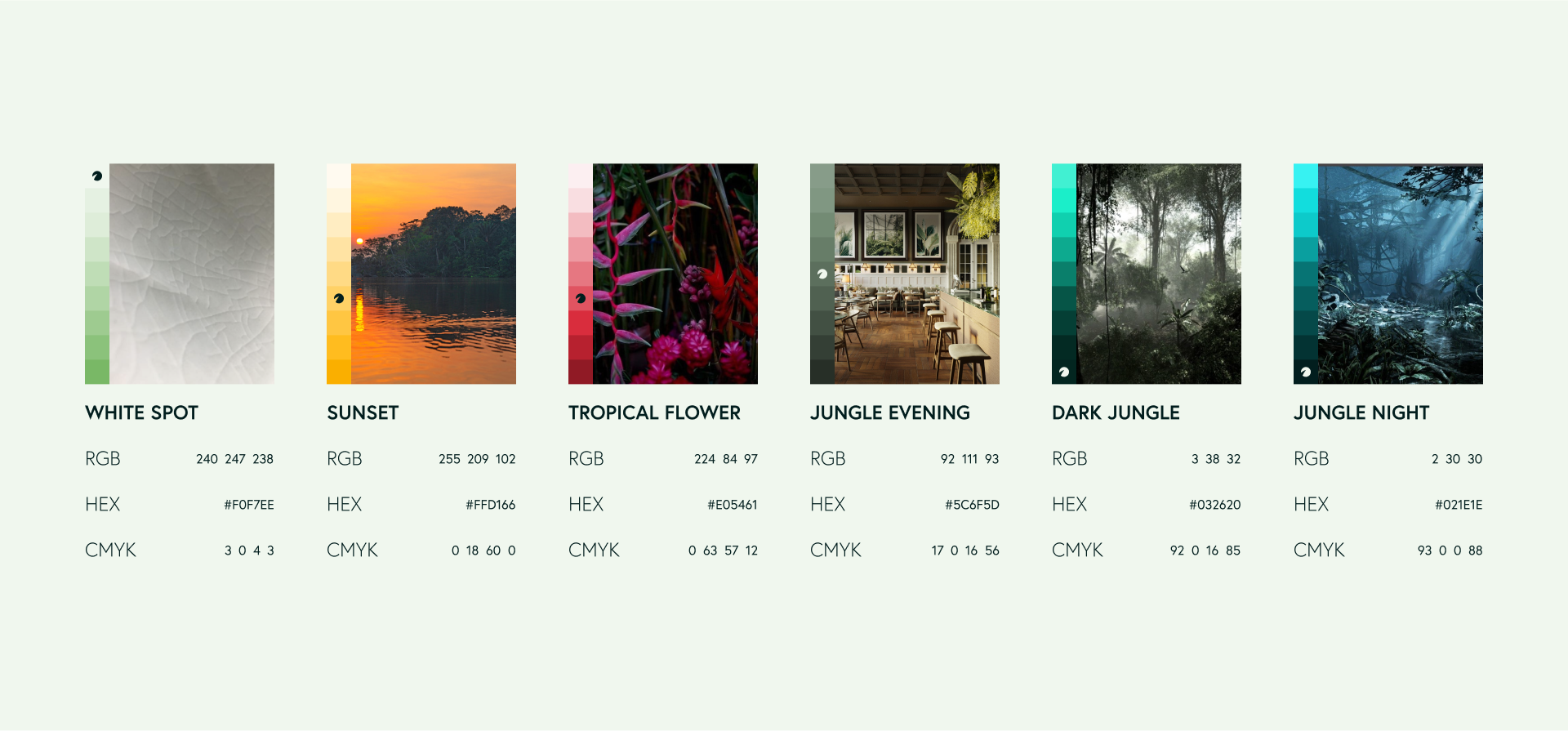
Visual System Architecture
The concept of ‘Modern Fusion’.
Reduction: Abandoning literal symbols in favour of abstraction and atmosphere.
Typography: A modern serif font (referencing tradition) combined with a minimalist sans serif font (referencing
the modernity of Asian cities).
the modernity of Asian cities).
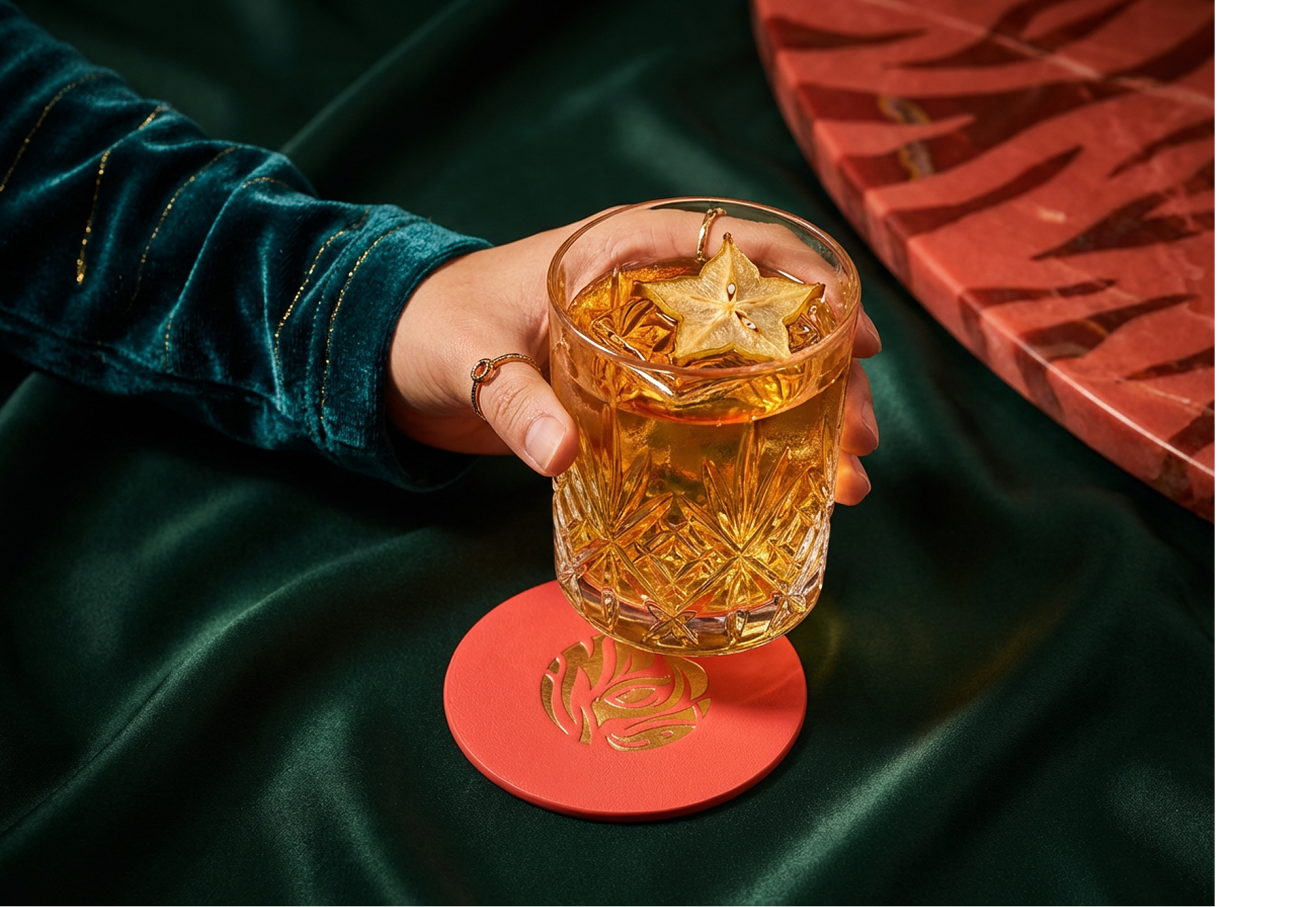
Sensory experience: The brand is built not only through sight, but also through touch. Selection of papers with a distinct texture, refinements (hot-stamping), minimalist menu.


Execution at Touchpoints
Consistency in this project is dictated by whitespace. Both the website and the printed menu feature the same wide margins and line spacing. This creates a sense of luxury and tranquillity, consistent with the experience of visiting the restaurant.


Thank you for liking and appreciating our project!