
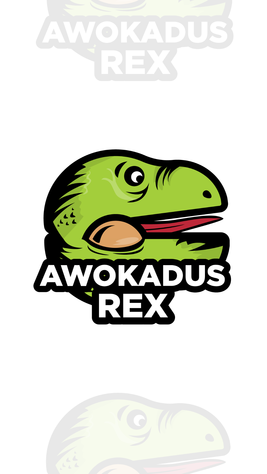
Creating a coherent, fresh image of art stickers. An attempt to transfer the world of the Pasibus brand onto the surface of the sticker. Using numerous elements from Corporate Identity Pasibus and creating a vision of joy and fun.
Illustration as an expression of the brand's vision in terms of what the brand has to offer. An attempt to shift the emotions associated with the events of roasting, cooking, preparing burgers, expressing happiness and fun and encouraging you to take advantage of the offer. Coherent colors and style allow to understand the idea of the brand and a casual communication style. Simple illustrations based on the representation of the image with stroke and fill, the style refers to website icons, to the visual communication of the brand that has evolved over the years.
These stickers are unique because the whole project is brand new and fresh, designed by myself using sketch, Adobe Illustrator and at least my imagination. I tried to reflect the humor and visual style, but I also added some elements of my own style.


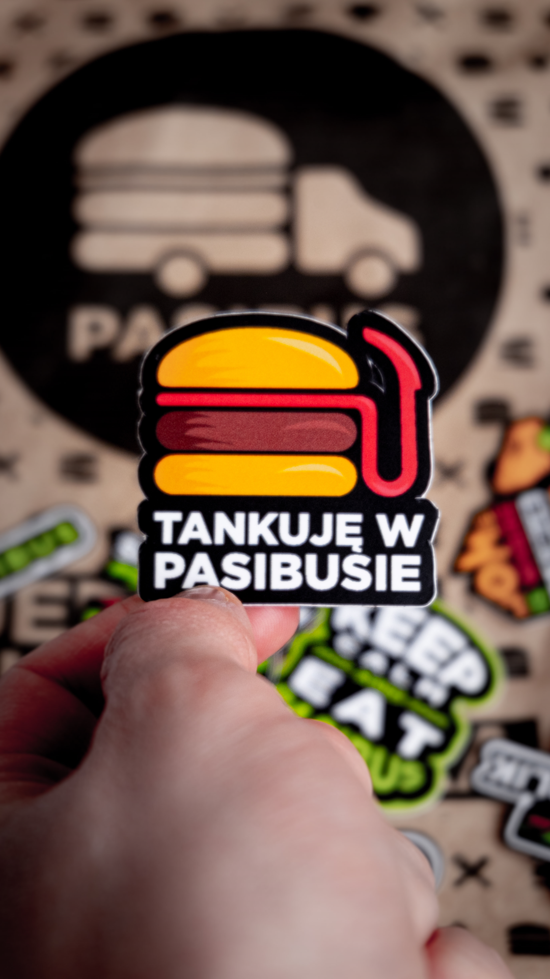


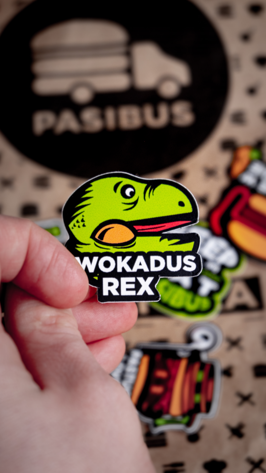


Pasibus also used stickers on his T-shirts and Hoodies, which are available at this address:

Thank you!
Kamilowany design – It is my personal brand, I'm a multidisciplinary one-man army.
I have four year experience in design for gastronomy and restaurant.I like also working with other teams, and doing new challenges. I prefer designs, illustrations, communications, branding for companies, small and big project. I'm a kind person with big empathy skills, I'm an HSP person so... it gives me a chance for deep thinking and better connecting and it makes that my project are more creative and interesting.
Stay tuned, follow me on Instagram: @kamilowany_design
or... if you like try my dribbble profile
Contact with me: MAIL
DO YOU LIKE MY PROJECTS? CHECK MY PHOTOGRAPHY SITE: